



 18 / 132

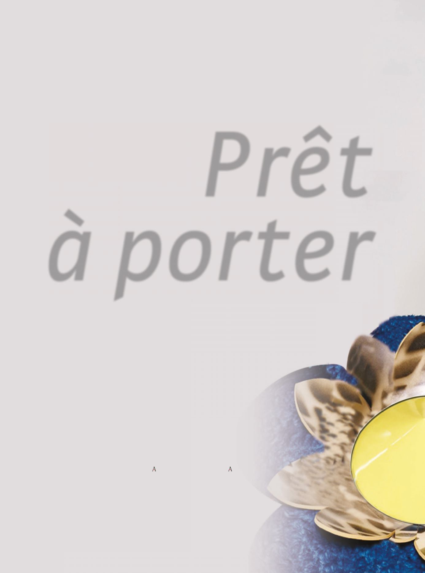
Prêt
à porter
E
s primavera, la temporada de llu-
vias inesperadas, calor con brisa,
cambios de luz y numerosos even-
tos sociales. Buscamos atuendos
que funcionen tanto de día como
de noche y que se adapten fácil-
mente. La clave de esta
Printemps
es versatilidad y
Prêt à porter
. Los
Pantones del 2016 sugieren una vitalidad que puede
generarse de manera insospechada; no sólo a través de
prendas y accesorios, sino aleatoriamente, al sostener
una taza de café color “Buttercup” en alguna terraza,
sólo por imaginar un ejemplo. Sin embargo, tanto el
“Rosa cuarzo” como toda la paleta de mentas y matices
cercanos al gris glaciar que armonizan con el azul “Sere-
nity”, son los tonos que dominan estos días del año, jun-
to con otros colores elementales como el blanco y el rojo,
combinados con elementos divertidos en accesorios y
motivos que se retoman sobre todo de los 60s y 80s.
I
t’s spring, the season of unexpected
rains, breezy heat, light changes
and a lot of social events. We are
looking for easily adaptable outfits
that operate both day and night.
The key for this
Printemps
is ver-
satility and
Prêt à porter
. The 2016
Pantones suggest a vitality that is
been generated by unexpected ways; not only
through clothes and accessories, but randomly,
when we are holding a Buttercup colored cuppa
of coffee at some roof garden, for example. How-
ever, both Rose Quartz and Blue Serenity as the
whole palette of mint and shades near to the
glacier gray harmony are the dominating tones
at these days of the year, along with other basic
colors like white and red, combined with funny
elements and accessories that are retaken most-
ly from the 60s and 80s.
Printemps
Texto /
Text
: AMURA • Foto /
Photo
: F&/%* / 4BLT FJGtI AWFOVF / Cortesía de las marcas
·amura·
16
rendez-vous